
Sounds easy – choose your colour scheme and away you go.
One year of endless Pinterest boards, numerous trips to the interior design section of the library, hours spent pouring over the internet searching for ‘Mid Century Eichler Houses’ and I’m no further forward. Bold colour or more muted palette? Wallpaper or paint? Curtains or blinds? Is the orange kitchen too much? It’s all getting a little hectic, so hopefully, this might be a good space to share some ideas, get some feedback and start working out exactly what the inside of this little retro dream is going to look like.
What makes a good colour scheme?
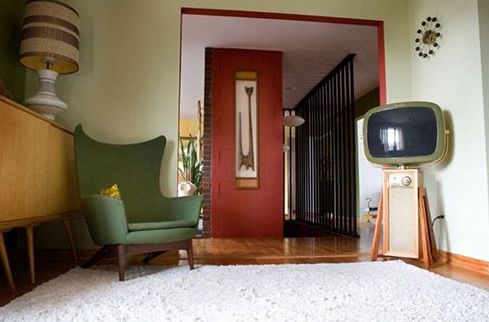
Wallpaper? Paint? Murals? Mid Century is all kinds of confusing.
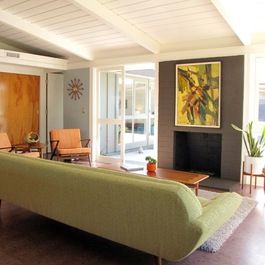
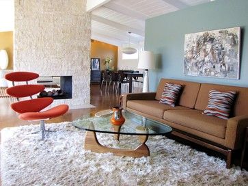
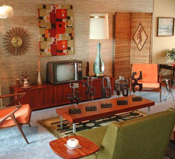
The original palettes spanned a few decades and originated in Palm Springs, a climate well suited to bright primaries and clashing colours. Fast forward to Katikati, New Zealand in 2018 and it’s all a bit different. As tempting as it would be to paint every wall in a different hue, the result could end up out of kilter with the surroundings and all a bit ‘headache’ inducing.
One thing we definitely know is we don’t want ‘beige’. Or ‘greige’. Or ‘white’. Colour is on the table. Oh, and we’re after the vintage version of Mid Century. No diluted ‘modern’ for us. So it’s sunglasses on, paint pots in hand and all suggestions welcome!
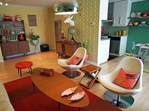

Go bold or go home. Actually go bold and it is home! Colour schemes can be changed, my advice, having owned and decorated 7 homes, add colour where it can be changed reasonably easily and cost effectively. So paint or wallpaper walls, add colour by furnishings, cushions, throws, bedspreads, and keep the bigger things more neutral, such as curtains, kitchen cabinets, bathroom suites. My colour palate had a huge sway towards purple, but turquoise is the colour of my lounge, with pine wood and cream curtains & blinds. Oh and I say black out blinds to stop sunlight with light curtains to soften the look. But of course it’s all do personal. If you want patterns then add them in a rug, as taste change very quickly. And another tip, although people laughed at me, try a bit of the potential wallpaper by hanging with blue tack a sample piece. You can decide after a few weeks of living with it. I actually never took the sample piece down as loved just the small amount of pattern it gave the room xxxx
LikeLike
Great tips! Love it! A bit trickier when you build because you have to decide everything up front, so when you move in, everything is complete. But we are working with a 3D render so I spend my days fiddling with colour schemes. And we made a firm decision early on to build the house to live in, not for resale! But Shane is a very clever bod and has designed it so if someone wanted to increase the size, add extra rooms etc, it can all be done. And if we really need to, we can just paint everything white when we decide to sell. Or sell to someone who loves colour just as much… even better! I might be in touch for more tips though. These are fab!
LikeLike